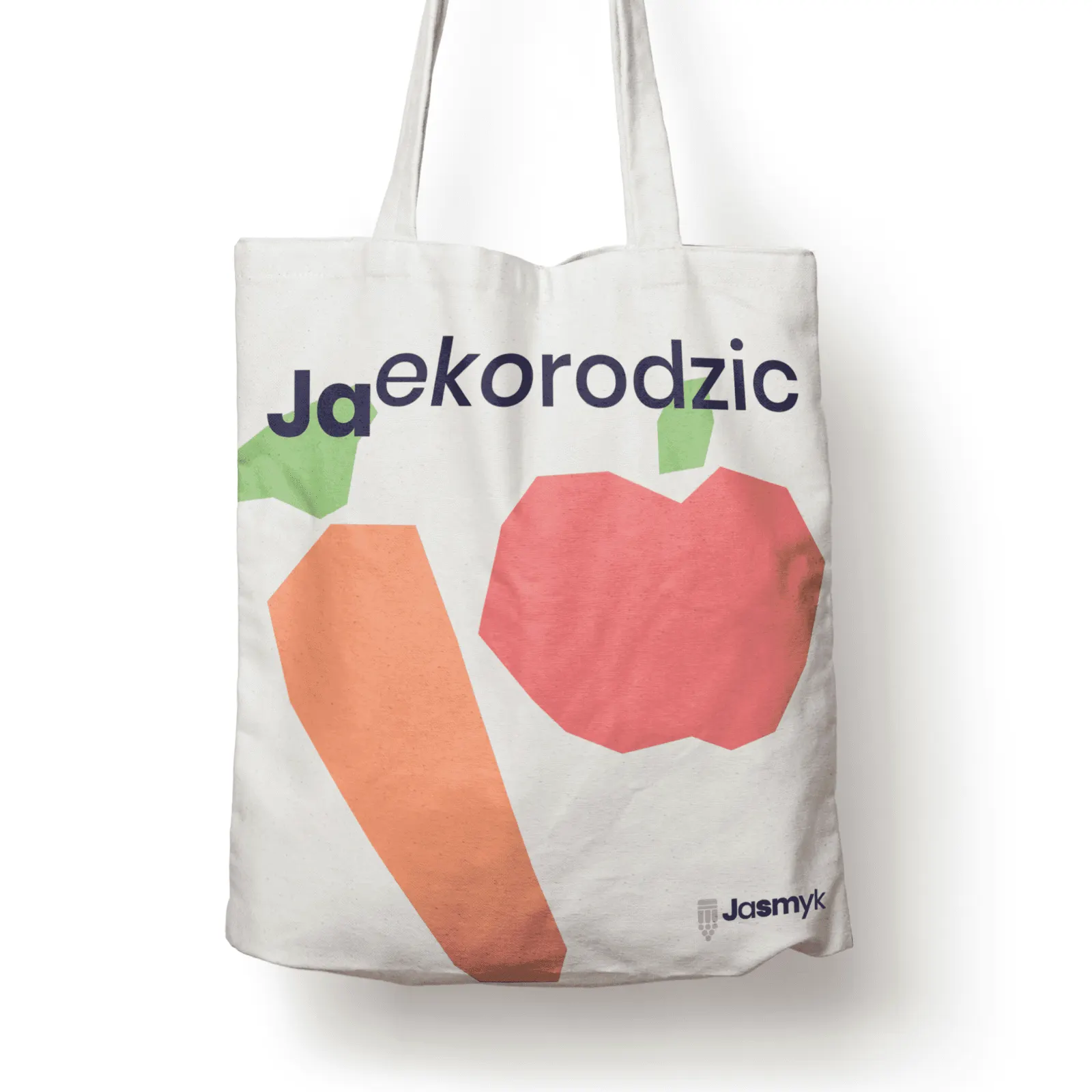
Child development at the heart of the nursery's communication
Scope
- Brand strategy
- Naming
- Logo
- Visual identity
- Promotional campaign
- Promotional materials
- Competition entry, not implemented
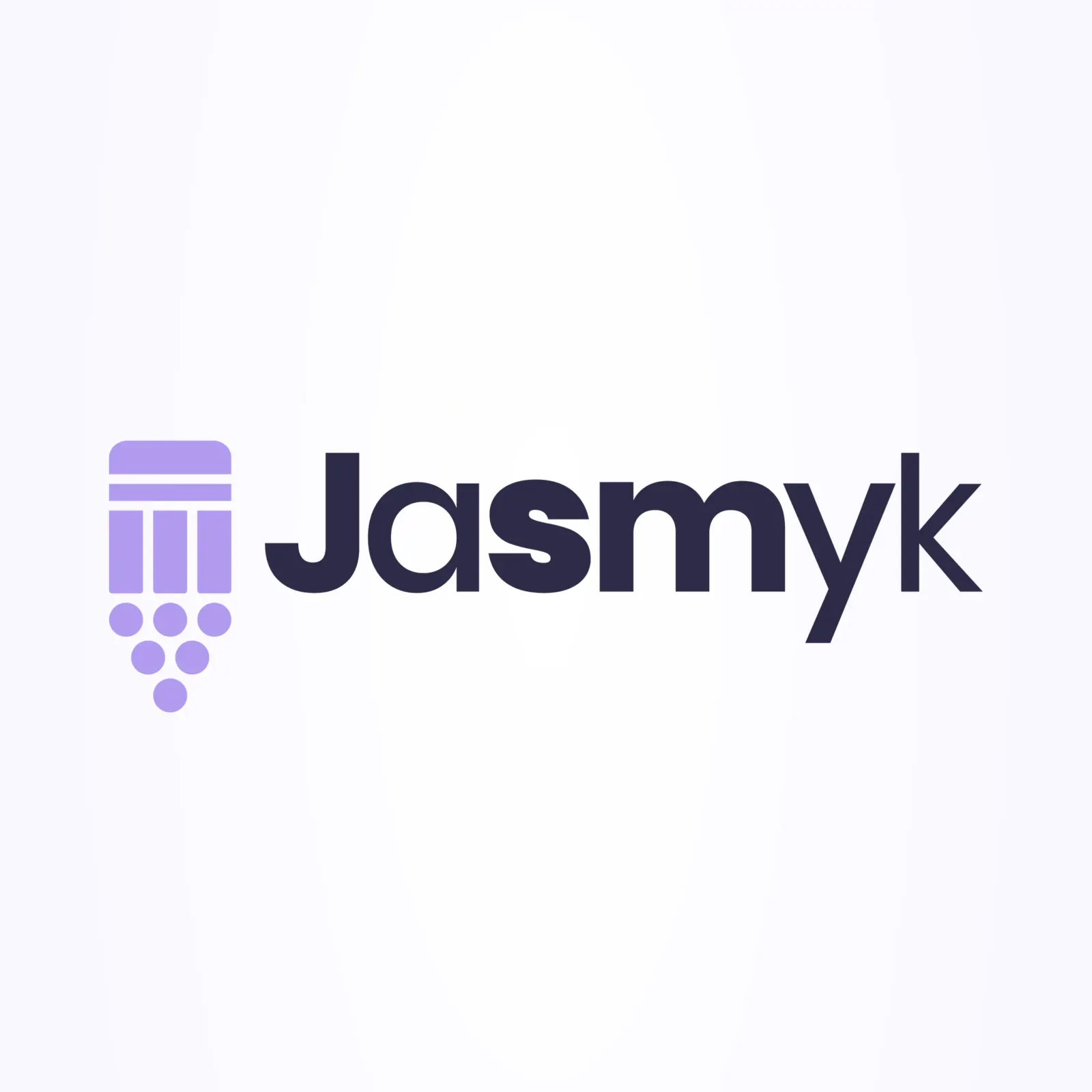
The main design task was to create a distinctive, memorable and simple combination of logo and name. Both ideas are based on the same principle, so they work together visually and in memory.
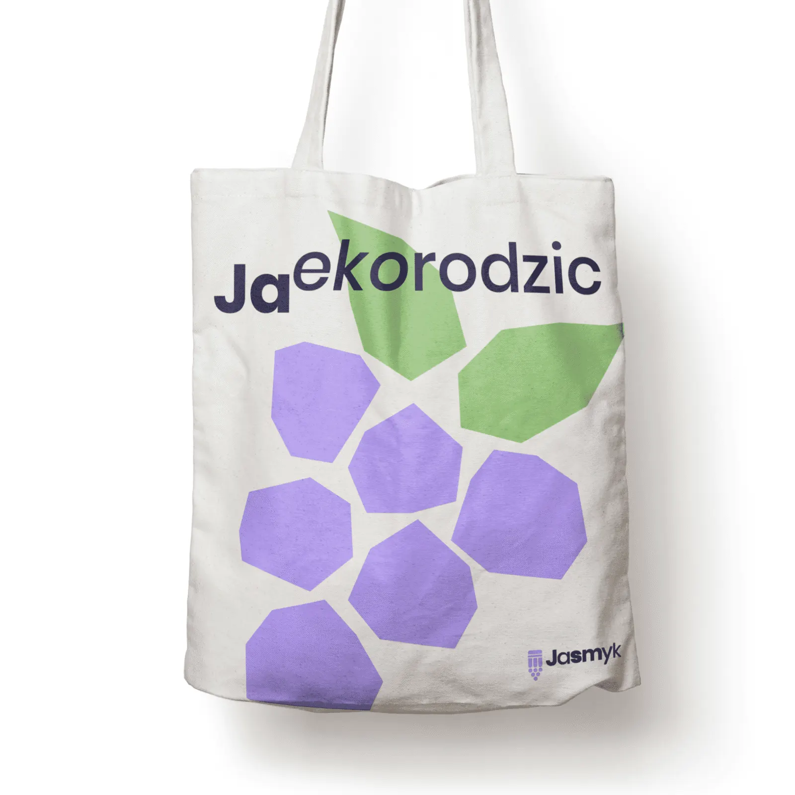
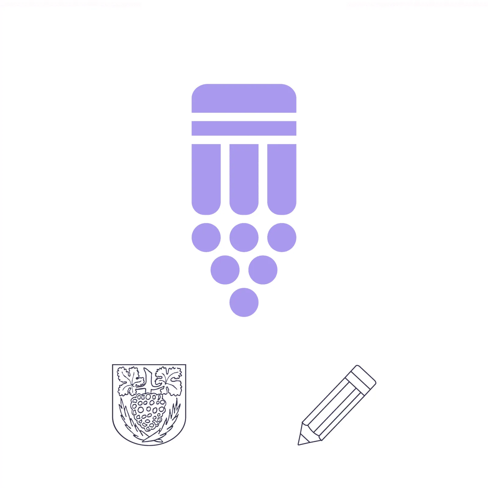
The symbol combines elements from a child's imagination: a pencil or crayon that lets a child express their personality and spark imagination, and a bunch of grapes worked into the tip of the pencil, the main element of the Jastrowie coat of arms. Setting the symbol slightly lower than the wordmark emphasises the link between the pencil and the hanging grapes. The bunch is also a metaphor: individual grapes grow up together, just like a group of children in a nursery.
The name joins an urban element (“Jas”, from the town's name) with “smyk”, a warm Polish word for a toddler. Jasmyk is easy to recognise and evokes positive associations.
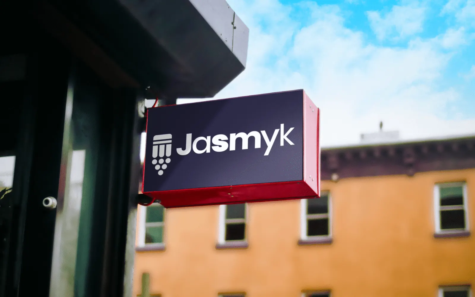
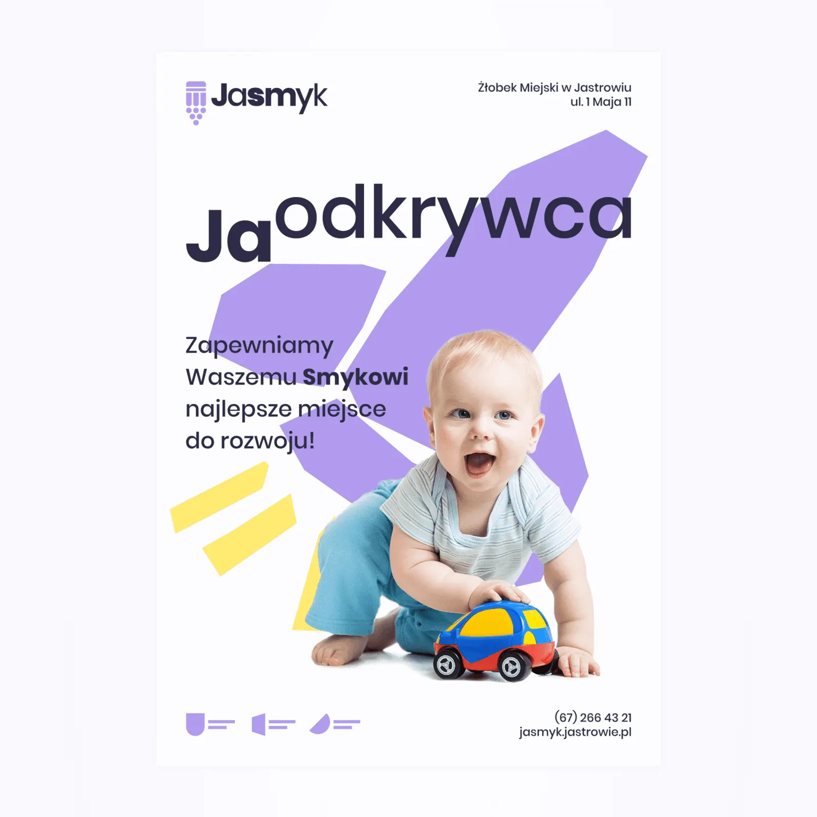
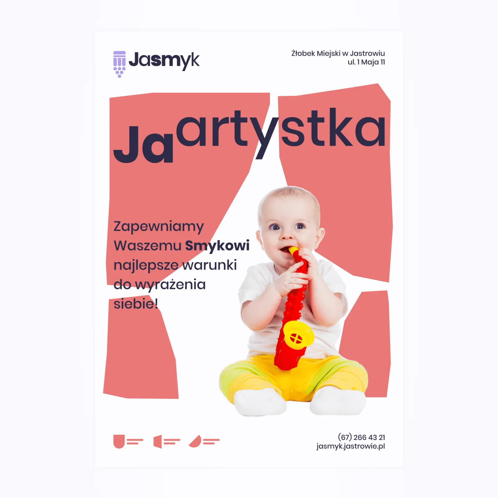
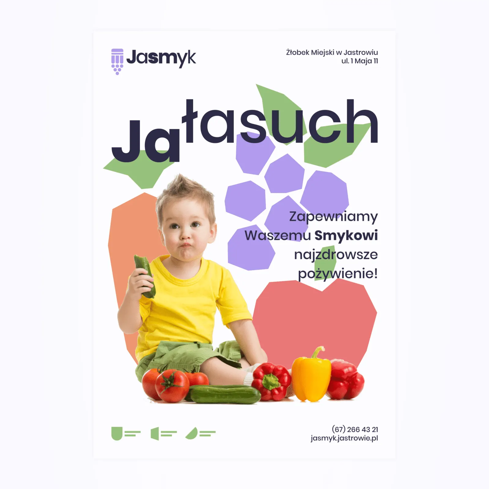
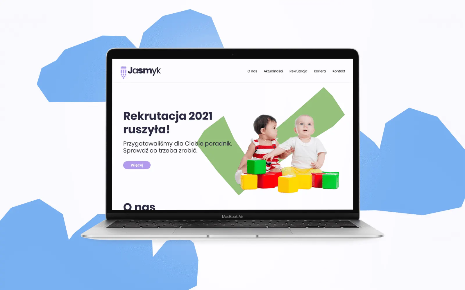
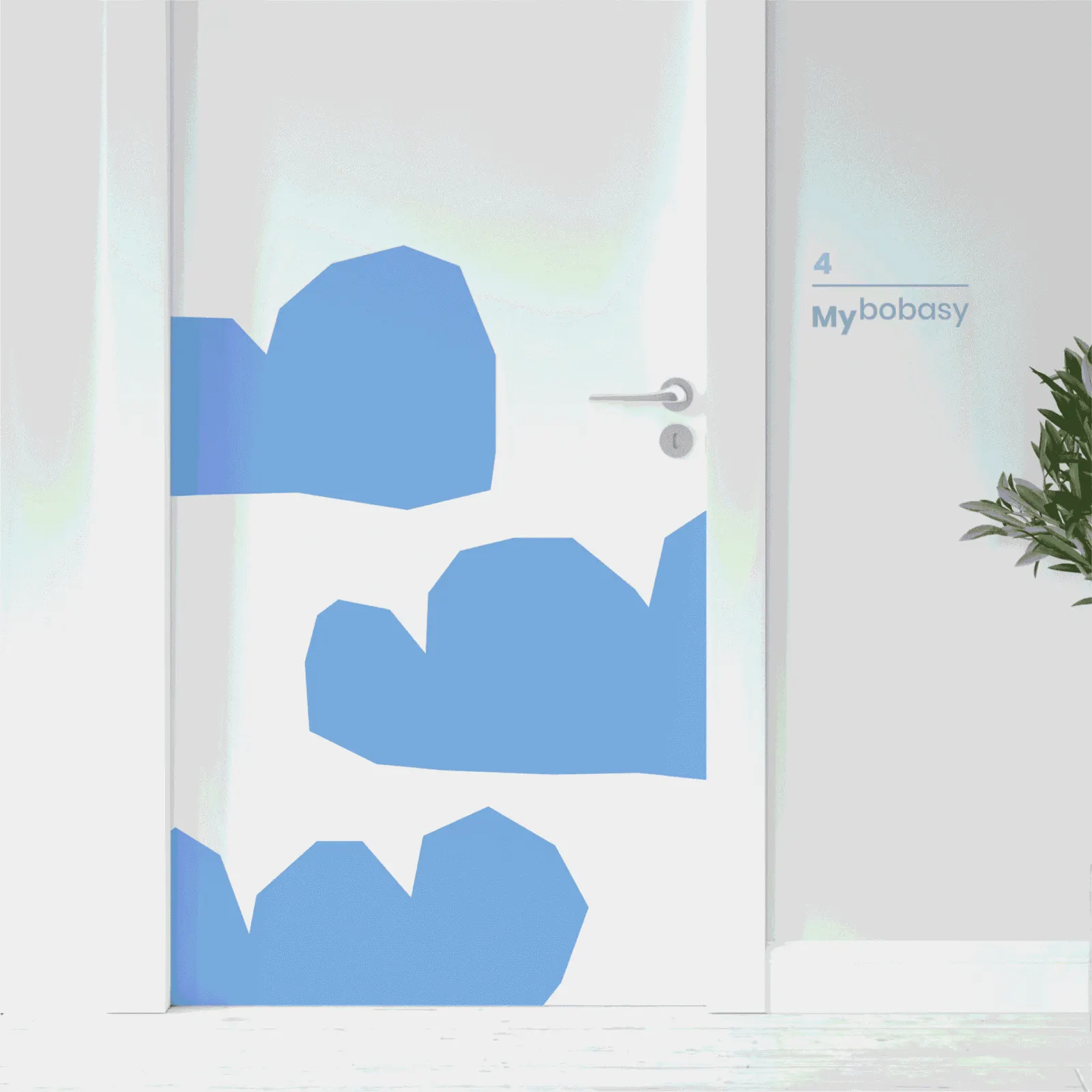
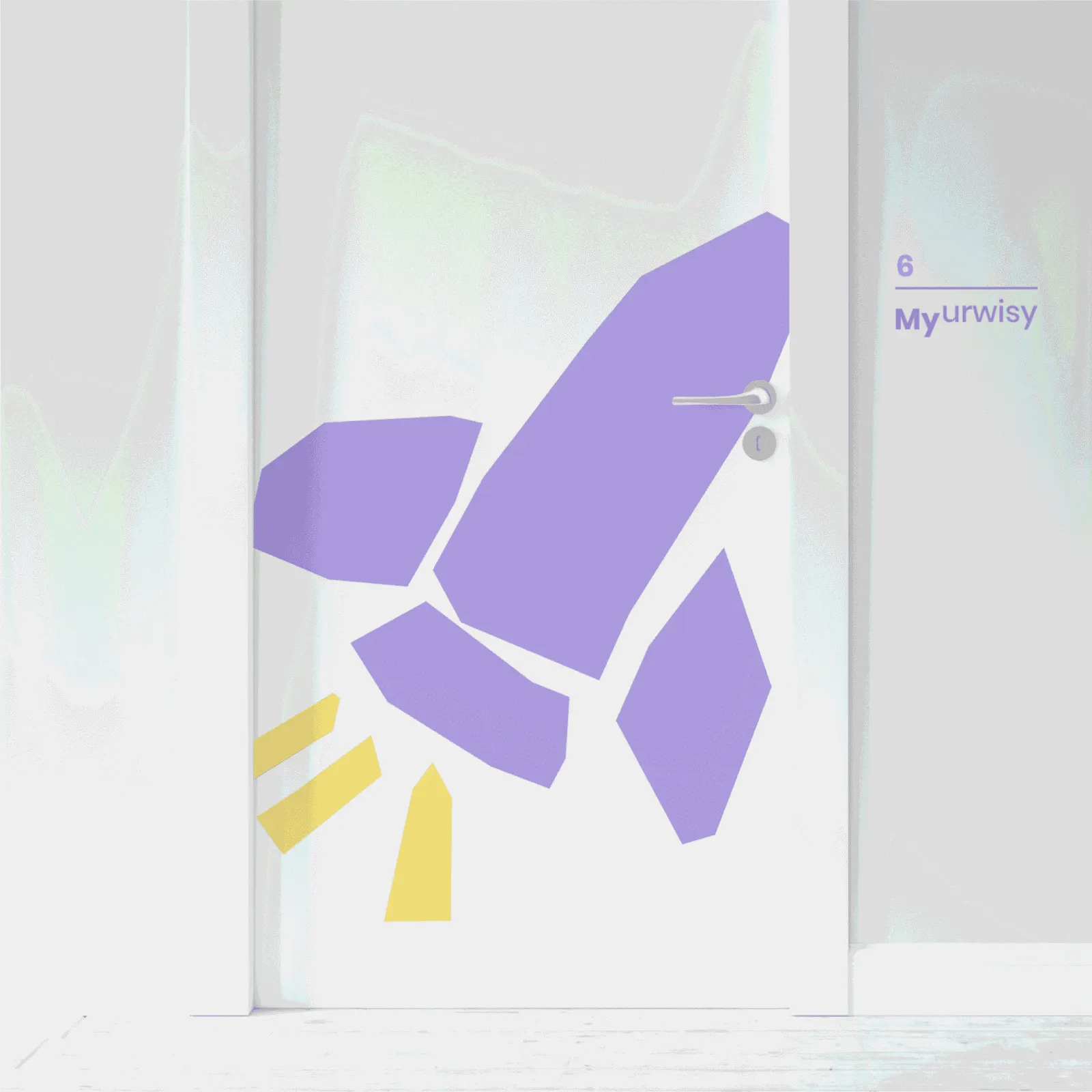
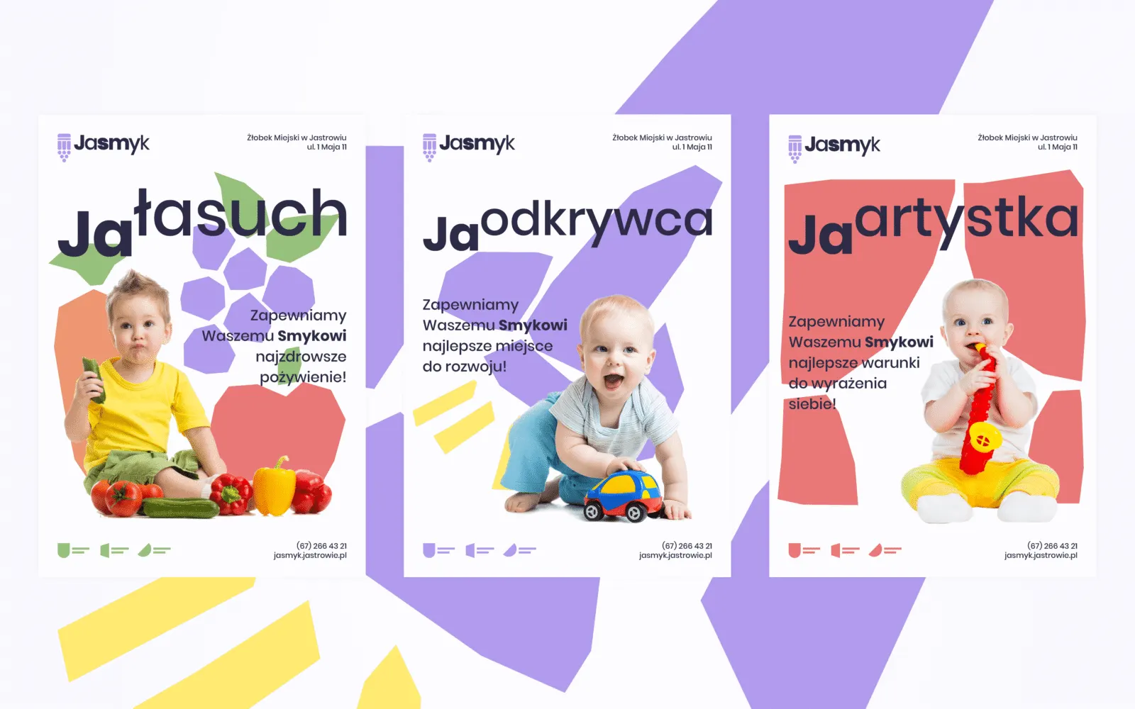
We also proposed a visual identity that completes the image and uses the full potential of the symbol and name. It is important to build a child's sense of self-worth and awareness of their own needs and emotions, so the campaign lines use the prefixes “Ja” (I) and “My” (we) to focus on each child's development. Simple drawings in the background recall children's paper cut-outs. Everything is kept in a calm pastel palette that soothes and supports the project's core idea: putting children and their needs at the centre.