A micro-scale energy revolution
Scope
- Branding
- Brand strategy
- Logo
- Visual identity
- Promotional materials
- Outdoor advertising
- Web design
- Web development
Ecoversus installs photovoltaic panels and heat pumps. Its visual identity had to express a close connection with renewable energy and ecology.
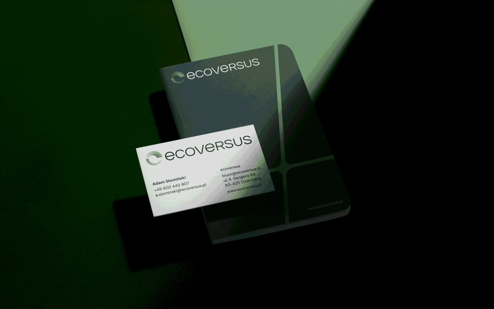
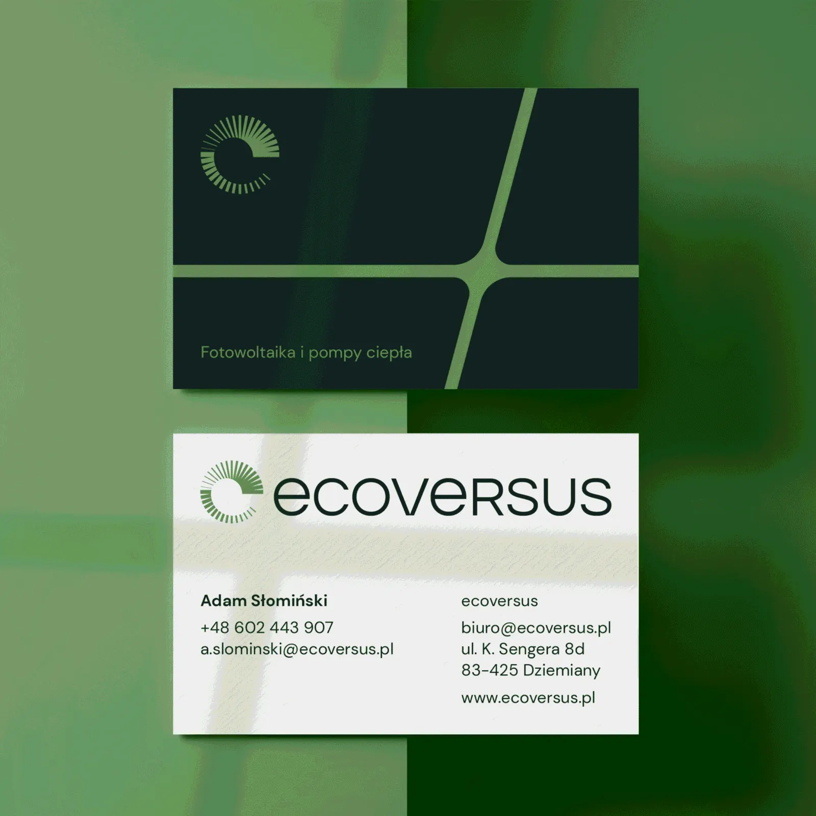
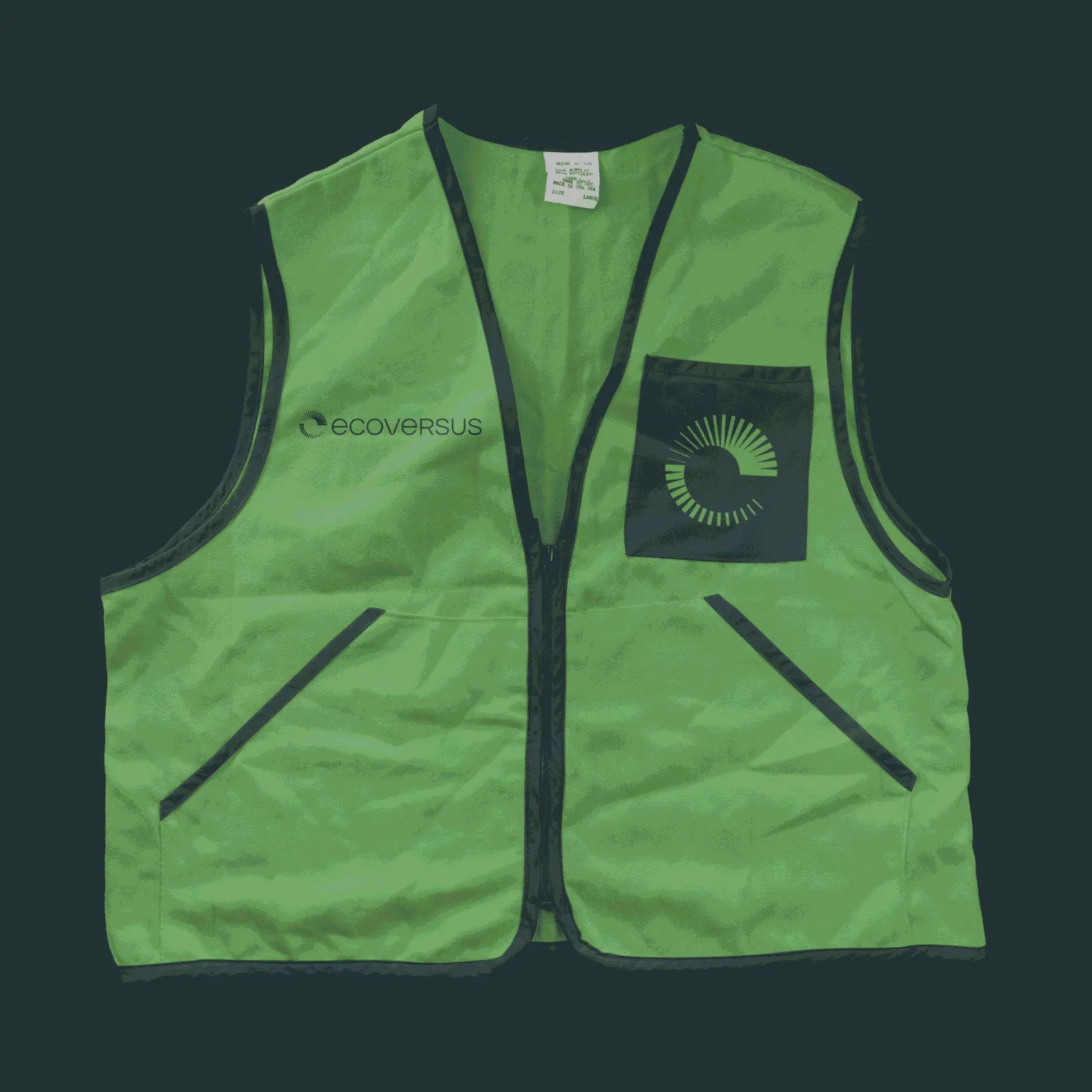
The logo uses a radial arrangement of elements and negative space. At first glance it reads as the sun and its rays, while also forming the letter “e”.
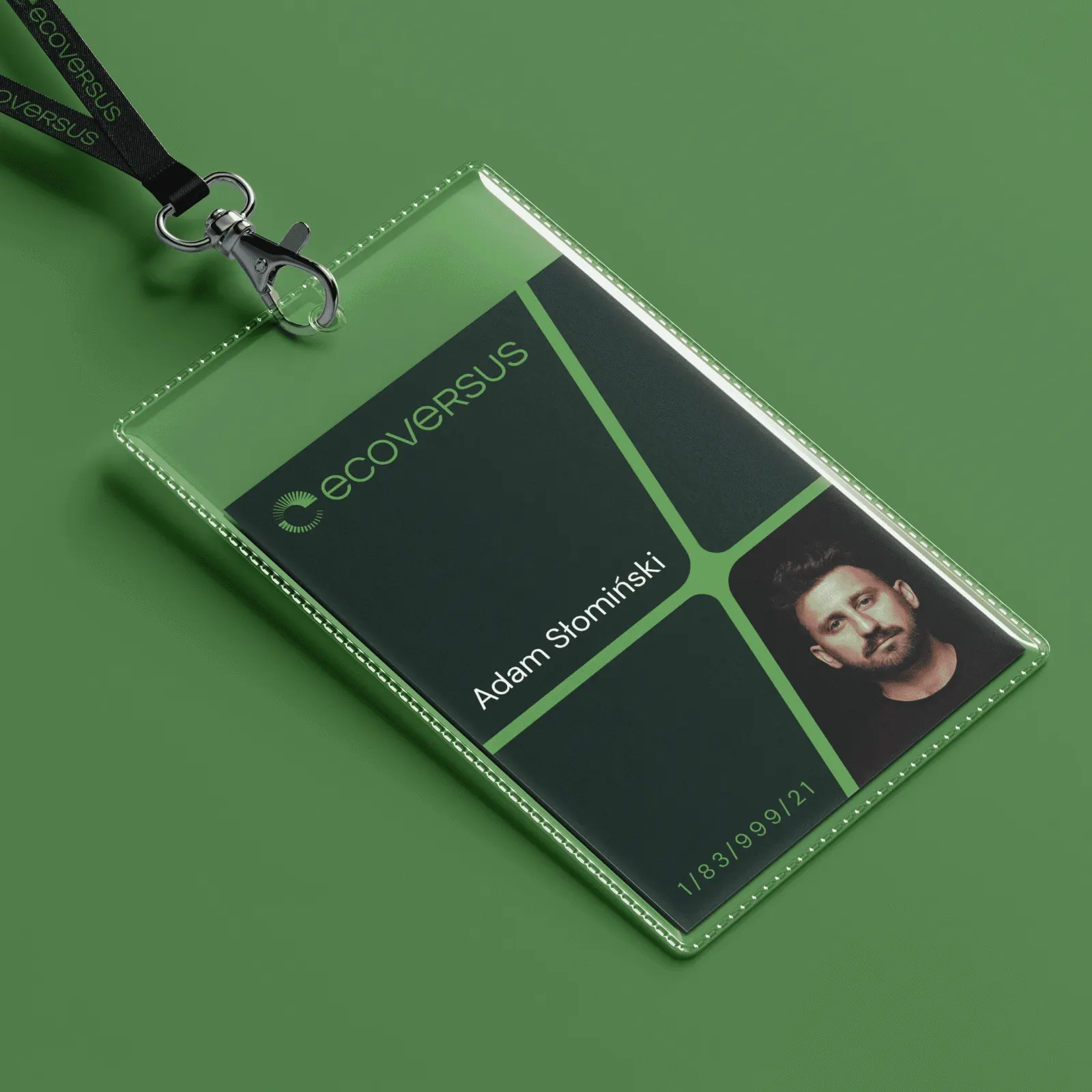
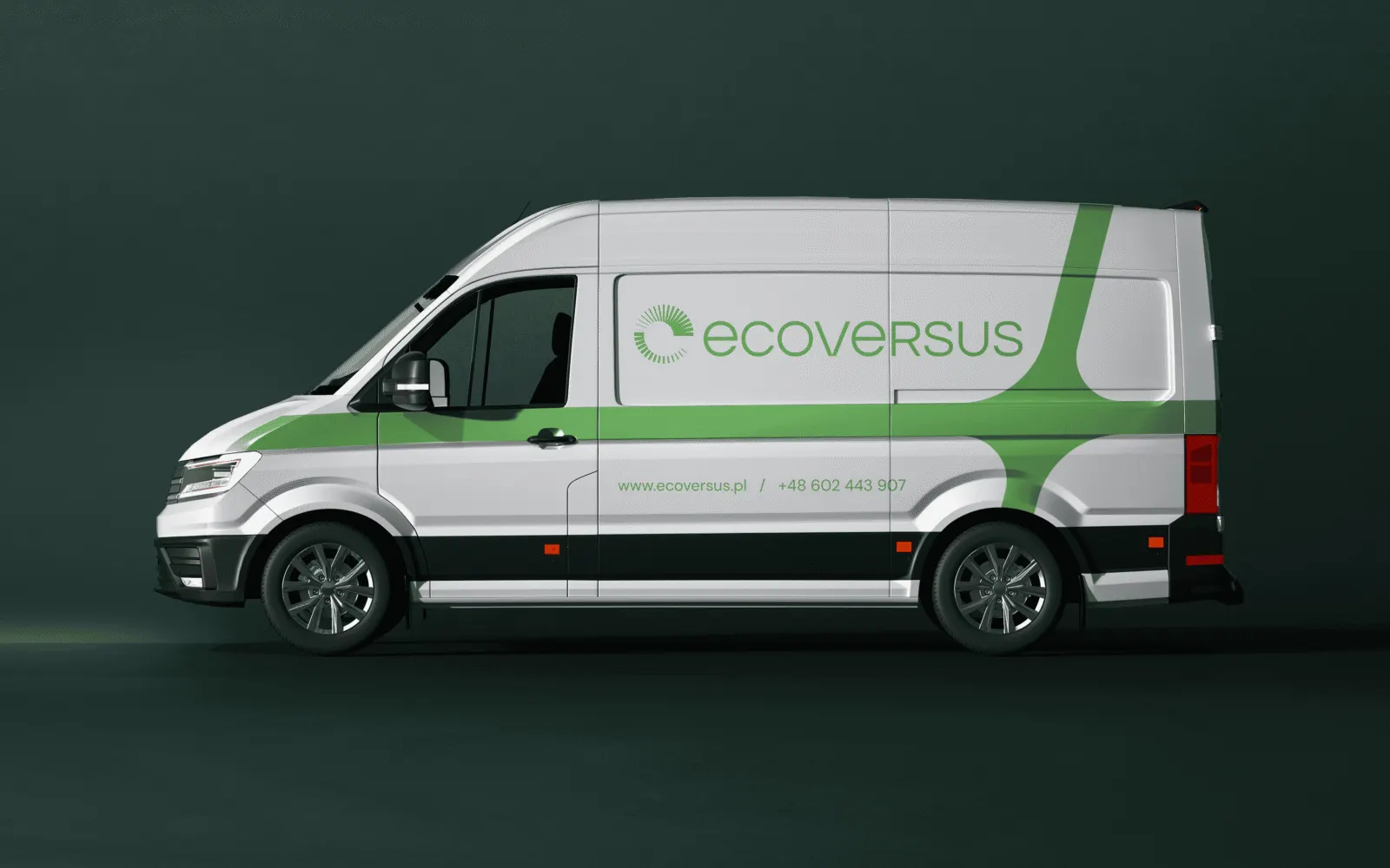
The identity is built on two shades of green closely tied to ecology and nature. The vivid green stands for the power of nature, the deep bottle green for the company's competence and credibility.
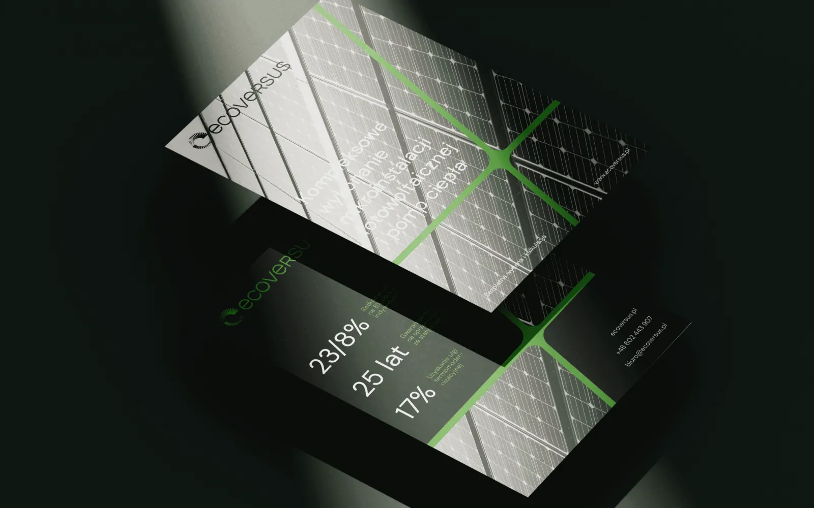
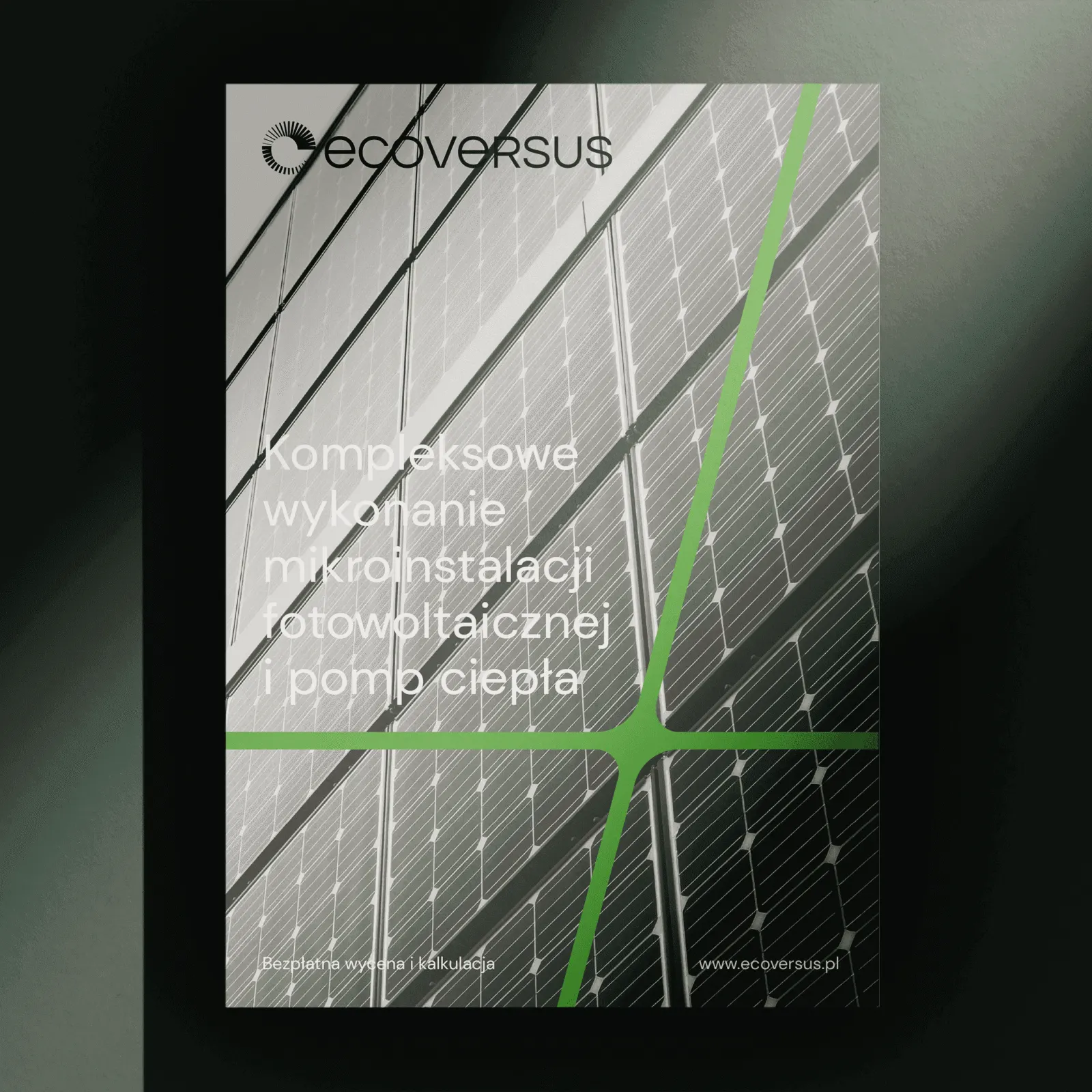
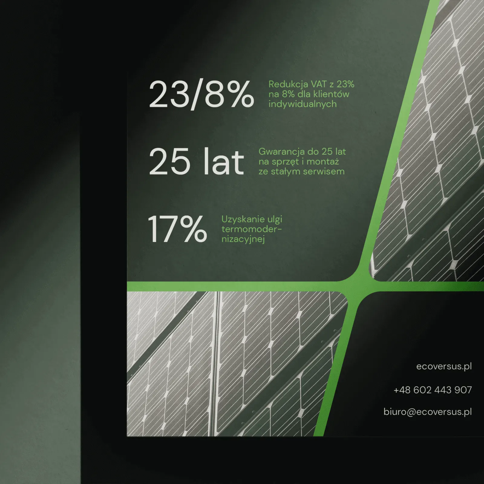


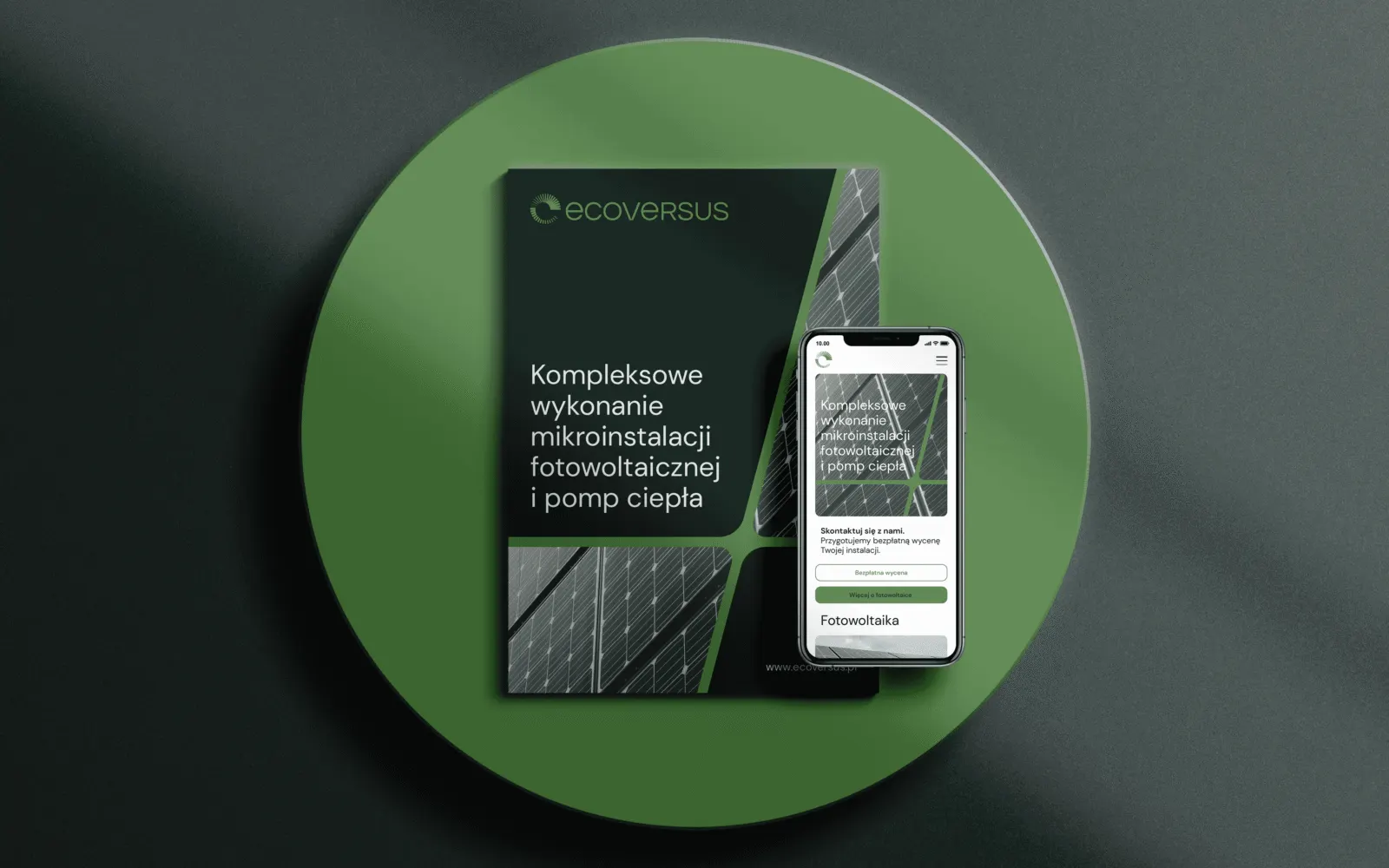
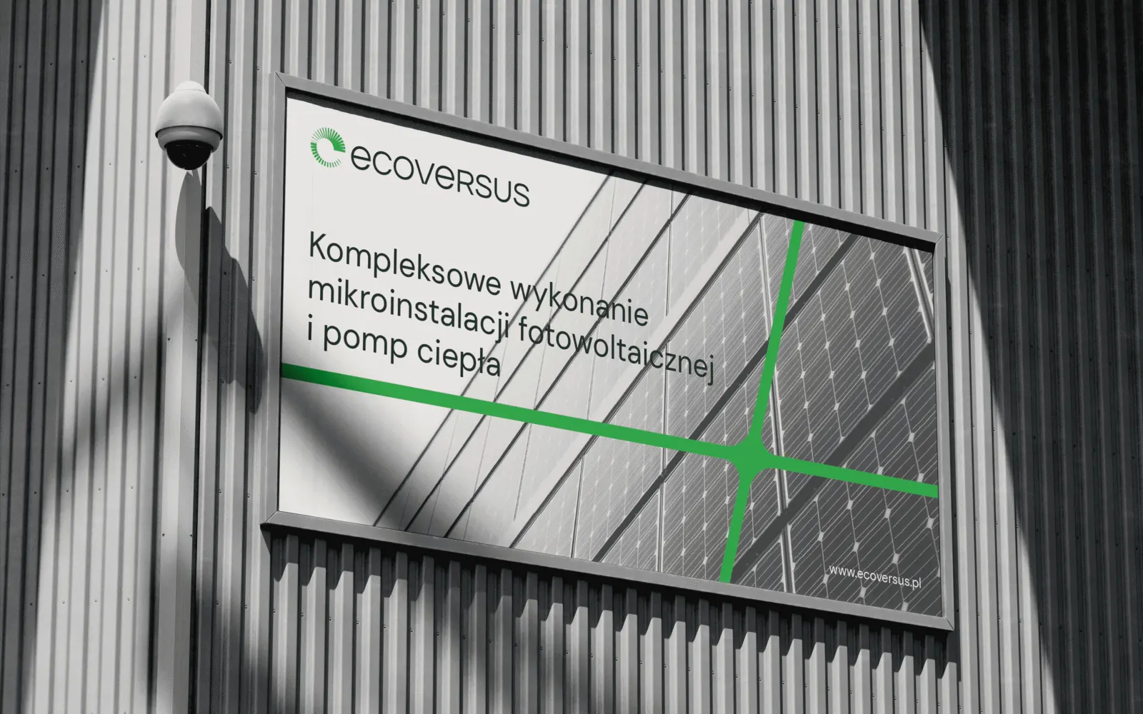
As in the logo, the graphic materials use negative space and emphasise the gaps between the cells of a solar panel. The result is a ribbon that wraps around the photographs and creates a distinctive, memorable shape.
The effect is reinforced by a slant that recalls sunlight falling at an angle.

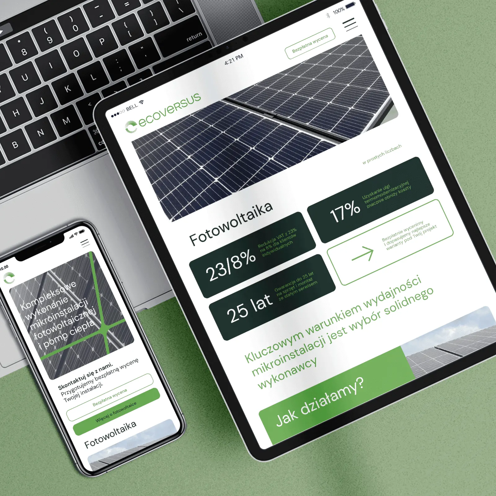
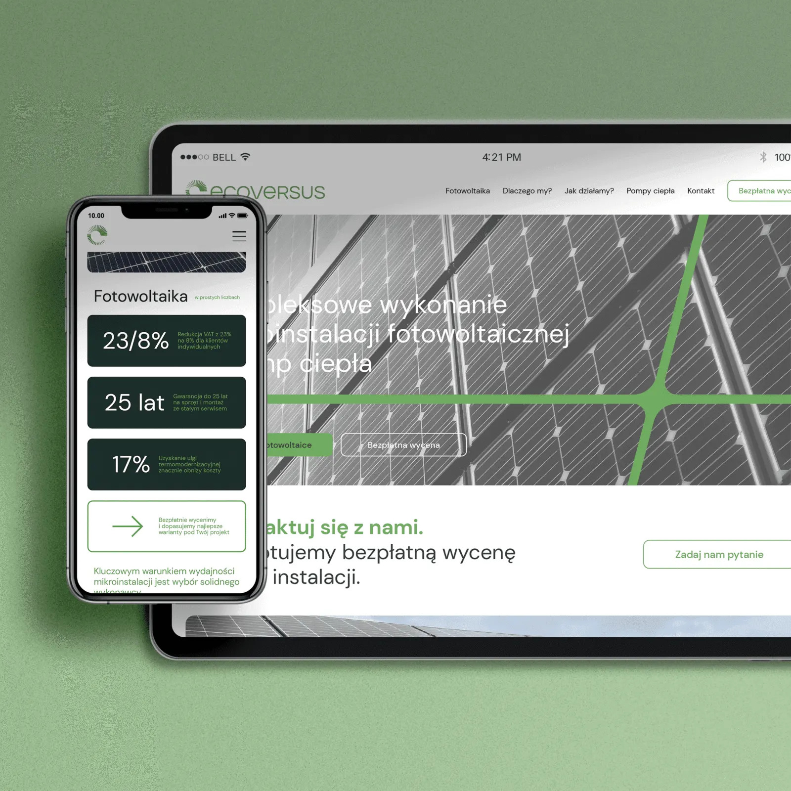
The website was designed so that users can easily learn about the benefits of investing in renewable energy.
Contact buttons are always within reach, so potential clients can quickly get information and personal assistance.